A Non-Themed Nursery
I should start this post off by saying that I am not a very crafty or artistic person. I appreciate that in other people, but I just don’t have that ability in me. That made setting up my baby nurseries slightly terrifying. There seems to be so much pressure about the nursery, doesn’t there?
With Bean, I’ll admit that I tried to play the nursery game. I selected a theme and a bedding set and tried to make everything match. It was a cute nursery, but I never really warmed up to it, to be honest. It kind of felt like I was putting him to bed in one of those nursery sets they stage in baby stores.
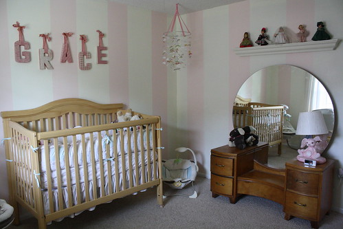
With Gracie, two things happened that changed things a bit. First, I was in a bout of depression at the time of my pregnancy that made the thought of decorating a nursery feel overwhelming. Secondly, we were living in a rental house and knew we would be moving soon, so it felt silly to put too much into her nursery set up. But, actually, her nursery came out perfectly because of those two things. We had, like, NO money when I was pregnant with Gracie, so we decided we would paint stripes in her room and that maybe that would make the room look decorated even though we didn’t have a lot of stuff in there. It actually worked! It looked a little bare, but not nearly as bare as it would look if we left the walls white.
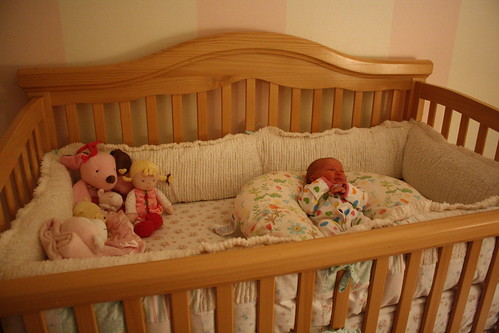
Gracie’s bedding set was beautiful. It was in a shabby chic style, with lots of ruffles and lace and all things girly. I would have used that bedding on my own bed if I didn’t have to share it with Chris!
Looking back, I probably would have not gotten crib bumpers for either baby. They are cute in the nursery up until the actual baby arrives. Then, you end up taking the bumpers down because they can be dangerous, so you spend $100+ dollars on a bedding set that is hardly ever used. If I did it again, I would start out with one of those breathable bumpers from day one. They are about $30 and come in solid pastel colors. They are practical and useful instead of something that ends up being stored away without being used.
Also in Gracie’s room that wasn’t in Bean’s was my beautiful vintage vanity from the 1940’s. My mom restored this for my room when I was a teenager, and I love that it made it into Gracie’s room. Using a giant mirror was a great way to add more natural light to the room because if you place it across from a window, the light reflects into the room (just make sure you aren’t shooting any sun rays directly at your baby while they nap!). They are also a nice accent piece and eye catcher without having to use a lot of extra decor.
Another thing I loved about Gracie’s nursery was that it had my collection of Madame Alexander dolls. My sister and I collected Madame Alexanders all through my childhood, and my mom collected them, too. In Gracie’s nursery, I displayed all of my dolls and one of my mom’s. I loved that personal touch in her room. The dolls didn’t necessarily match the room, and there was no theme to follow. But they seemed to just belong.
I’ve tried the themed nursery and I’ve tried the free-flowing nursery. It differs for everyone, but I really enjoyed not having a theme in Gracie’s nursery. It gave me a little more freedom with what I chose to include in her room because I wasn’t always having to worry if it fit into the theme. It also made the room more flexible for decorations, which was especially important since we had a limited budget.
Now that our kids are older, their nurseries are changing into bedrooms. Bean’s room changed over this summer, and I love that it doesn’t have a real theme either. Instead, we chose to use colors to help us decorate, much like we did in Gracie’s nursery. We will be upgrading Gracie’s nursery into a real bedroom in the coming weeks, and we’ll be keeping with our idea of color themed rooms instead of actual themes.
So far, it has been the easiest approach for our family, and has given us the best rooms. The good news is that no matter what the room looks like, your kids are the main attraction and the more their rooms reflect them as people, the better the room looks!
Check out the†Huggies Mommy Answers Facebook app†and find more posts from bloggers sharing their experiences of motherhood on the†Huggies page on BlogHer.com.


3 Comments
Alaina
We did the monkey themed nursery thing, but it’s not overtly monkey. I love the cute personal touches you made, especially the restored vanity. She’ll treasure that as she gets older.
Nicole (Piper_E)
I can’t believe you didn’t talk about or show a picture of Gracie’s mobile! That is my favorite! I still want one in Kendall’s room and she is almost 5! Lol!
Mae
I LOVE the simplicity of Gracie’s nursery! I remember when you posted pics of it. I was going through the same thing as you were at almost the exact same time so reading your blog helped me “cope” with an unexpected pregnancy with a newly turned 1 year old boy and not much money since we just bought a house the month we got pregnant! I didn’t do a theme in her room either, but worked the colors pink and green into it. I really liked Gracie’s butterfly mobile and almost bought one for Avery’s room after seeing your blog, but I ended up making something homemade in attempt to be crafty…it turned out ok. lol I can’t wait to see pics of Gracie’s big girl room!